Wednesday 16 March 2016

Film Production Feedback


1. Opening sequence
  • Include dialogue : can't be silent
2. 1 minute - audio on clip
  • need to be merged better 
  • re-record dialogue - dub over? 
3. Soundtrack/Music
  • Create atmosphere 
  • Start experimenting 
4. Complete filming 17/3/16

5. Edit before Wed 23/3/16

Friday 12 February 2016

BFI trip notes

I didn't attend the BFI trip however I did manage to get some information and notes from my peers.

I learned that :

  • The BFI and other independent cinemas exhibit low budget films.
  • There are multi-complex cinemas which are cinema that have large chains e.g Vue cinema and Odeon.
  • The are prestige cinema which have low budget films but have big actors.
  • The sub genres are horror,heritage,franchise,social realism and urban fairytale.
  • some examples of film distributors are vertigo and warp.

Wednesday 10 February 2016

Attack the block


Attack the Block is a 2011 British science fiction comedy-horror film written and directed by Joe Cornish

It is about a teen gang in South London who defend their block from an alien invasion.The group spend the whole nigh trying to fight off and kill the aliens before they start to terrorise the community that they live in.It balances fright with laughter really well and features solid performances from everyone in the cast.The use of gruesome aliens and a great setting that features outstanding action scenes all make it the great film that it is.The target audience for this film would be a 50:50 split of male to females and for those who are living in London or close to London. In terms of camera shots and editing I could see a lot of straight cuts being used , this helped to speed up the pace of the film especially in the fast paced scene where the teenagers had to fight off the aliens. In terms of characters I could see a lot of low angle shots used on the teenage boys which made them appear as powerful and in control towards the audience. This was used especially on the main character Moses who portrayed leadership skills and control throughout the movie.

Friday 22 January 2016

PROGRESS REPORT


Work completed since 6 January

The Script for our production
the storyboard and shot list
preparing all of the props
Getting characters to play in our film

Any incomplete pre-production tasks

We have not yet completed our photo shoot however we will be doing it next Thursday.


Next steps/Action plan

We have all of our characters and props prepared for out shoot so we will be shooting from the 25th and onwards. I will also be working on my print design brief by taking head shots of the main characters and writing about each of them.

Date filming will be complete

Our aim to get the filming done by is the second or third week of February. However, there may be some other times when we have to re-shoot some scenes if they do not fit the way we want it to be (whilst doing the editing).

Requirements for photoshoot next week

Make sure the main character is wearing dark coloured clothing.
Have bright coloured lightings
Make sure that half the main characters face is shadowed
Also bring the props, e.g. coca cola bottle which is a main prop that will be used in the film

TRANSGESSION : Double page spread

Our film idea is about a group of teenagers who hangout everyday on an abandoned old rooftop. However one day it all changes and their casual chilling sessions are no longer 'chill' but in fact 'chilly'.  The group of teenagers decide to play a game of spin the bottle which changes everything they've ever known. The aim of the game is for the bottle to land on someone and that person gets one hour to change their life, whether that be going back in time or going into the future. Unfortunately the first spin of the bottle lands on the mentally-ill boy Jason ,who decides to take Grace on his adventure with him. The end result of this is that Jason ends up killing Grace with his baseball bat and the rest of the teenagers eventually find out. The groups aim is to find out why he did it and to try and cover up her death from the police.

'Don't trust a pretty face'

This is one of the most significant quotes of the film as 'pretty' is a term usually used for females. However it is not Grace that can not be trusted it is Jason. The use of the word pretty will make the audience think that it is Grace that will cause the drama in the film as she is the only female figure on the front cover of the film poster. I think the use of this quote will create a big impact on the viewers as they will be shocked to see that Jason is in fact the 'pretty face' which changes their perception on males. This quote may have also thrown off the audiences view towards the movie as they  may have already predicted the story line.

'Not everything is as it seems'

This quote is significant as it contrasts well with our movie. By looking at the film poster of the teenagers the audience will view them as innocent teenagers due to their friendly faces and code of conduct. However 'not everything is at it seems' as each one of them have a deep dark secret from the past that will eventually be revealed in due course throughout the movie. This contrasts with the film title 'TRANSGESSION' and this means an act that goes against a law, rule or code of conduct.

Main characters

Jason is the main male character who is a mentally disturbed boy. His past experiences in life have made him into the disgusting, disturbed teenage boy that he currently is now. His man aim in life is to gain power and the attention of others. If he lacks any of these two traits he begins to act crazy and his mind begins blurred making him unable to differentiate reality from things that are in his imagination. This causes he to make irrational decisions that affect the other in his friendship group.

Grace is the main female character of the group , who everyone assumes is the 'pretty face'. She is viewed by others as the pretty girl in the group who is vulnerable and innocent. This is portrayed in the movie when she deicides to walk into a dark , gloomy forest with Jason without any hesitation.

Wednesday 20 January 2016

Research


1) Key conventions. Look over the magazine cover key conventions notes sheet and ensure you can confidently identify the key aspects that are found on a magazine cover.


2) Write an analysis of this BFI Film Festival programme front cover. How many of the 12 key conventions of magazine covers can you see? In what way does this print product differ from a traditional magazine cover? How have the designers made this programme visually interesting?

On this film festival programme colour I can see a title of publication that is printed in big , bold letters with the word "FILM" being the focus of the spread. In terms of the colour scheme the bright colours reflect off of the black background which makes it stand out more,making it more appealing and noticeable for the readers enticing them to what its about. The use of the language for example 'in partnership with' and 'American Express' suggest that this film company is quite serious about their business and are also very high up in what they do as they are in partnership with quite high companies with reputable names that are widely recognised. Instead of using colour to fill in the words, they've used an image of a persons face with the eyes being the sole focus which is effective as it makes people stop and read the poster. This is also effective in the sense that it is something different and more complex as opposed to something boring like plain colours.


3) Find at least 5 arts centre or cinema programmes/brochures aimed at a similar target audience to your project (art house cinema). For each one, pick out one design idea that you could use in your own print work.


I could use their idea of using the whole image as the background .The image could consist of the 5 teenage characters that will be in our film.


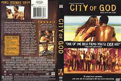
I could use their idea of having more than one image on my print work. Also my title of publication will be big and bold like how they used theirs.


I like the idea of turning the title of publication into the central image of the cover. I may consider using this idea for my print work.


I like how the text links well with the central image. The title of publication is 'cyberbully' which contrasts with the central image of the teenage girl alone on her laptop. It signifies how she is lonely and on her laptop which links well with the word 'cyber'. She is also bending her head down at the laptop and holding her mouth , showing the disgust she has for whatever she is looking at on the laptop. This links well with my target audience of young teens as this is something that is common which a lot of teenagers.


I like the idea of the male and female facing each other as they are in love. This will link well with my film and target audience as our idea is about a two of the characters who like each other and fall in love however it doesn't end very well. I think by using an image like this for my print work will deceive the audience of the outcome of the situation and make them more shock and intrigued with our story line.


4) Find at least 5 contents pages from arts programmes or magazines. How are contents pages designed? How do they use a combination of text and images to create an effective design?


1) This contents page contains a large title of publication which is usually what draws the readers attention first , however it mostly contains a large image that is quite colourful.


2) This contents page has a lot of things going on at once. It is not one of he best contents pages I've seen however it does have some key conventions such as its title of publication and use of two images. These two conventions work well together as the image links back to the title of publication informing us that this is the name of the film and the image gives us a brief look at what we may see if we watch it.


3)This is a simple contents page where the whole image is the background. There is a minimal amount of text however it is not very easy to notice so it may not be as important as the image itself.


4) This contents page splits it importance of advertisement equally. Half of the page is the image they are advertising and the other is text about information on the brand shown in the image.


5) This contents page has a large amount of text surrounding a small image of a female. This image is advertising the brand vogue which is written in bright, red , bold letters which will automatically gain the readers attention.